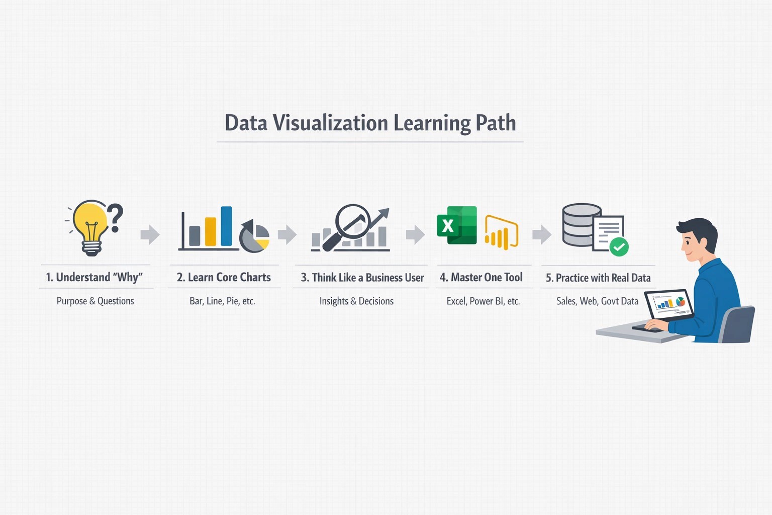
How to Learn Data Visualization the Right Way
Data visualization is not about decorative charts. It is about presenting data in a way that is clear, meaningful, and reliable.
Many beginners start with tools first. That is the wrong order. The right way is to learn thinking first, then tools, then practice.
This guide explains how to learn data visualization step by step—the way companies actually expect.
1. First, Understand Why Data Visualization Exists
Before touching any tool, understand the purpose.
Data visualization helps to:
Explain trends and patterns
Support decisions
Communicate insights to non-technical people
Reduce confusion from large data
A good visualization answers a question clearly. A bad one only decorates numbers.
👉 Ask yourself every time:
“What question should this chart answer?”
2. Learn the Basics of Charts (Not All Charts Are Equal)
Do not try to learn every chart type at once.
Start with core charts used in almost every company.
Focus on:
Bar charts – comparison
Line charts – trends over time
Pie / Donut charts – simple proportions (use carefully)
Tables with highlights – detailed data
Stacked charts – composition over time
Learn:
When to use each chart
When not to use them
Example:
Do not use a pie chart for 10 categories. It becomes unreadable.
3. Learn to Think Like a Business User
This is where most freshers fail.
Companies care about:
Revenue change
Cost trends
Performance gaps
Risks and outliers
Practice converting data into business questions:
Which region is underperforming?
Why did sales drop this month?
Which product is growing faster?
Visualization is storytelling, not decoration.
4. Start With One Tool (Do Not Jump Between Tools)
Choose one beginner-friendly tool and stick to it first.
Good starting options:
Excel or Google Sheets (strong foundation)
Power BI or Tableau (industry tools)
Python (Matplotlib / Seaborn) if you like coding
Do not learn all at once.
Master one tool properly, then others become easier.
5. Practice With Realistic Data, Not Perfect Data
Avoid only clean demo datasets.
Use:
Sales data
Website traffic data
Student performance data
Public government datasets
Learn to:
Handle missing values
Fix inconsistent labels
Highlight important insights
Real-world data is messy. Companies expect you to handle that.
6. Learn Design Rules (Simple > Stylish)
Good visualization follows simple rules:
Clear titles
Proper labels
Consistent colors
Minimal clutter
No unnecessary effects
Avoid:
3D charts
Too many colors
Decorative icons without meaning
Clarity always beats creativity in professional work.

7. Build Small Projects and Explain Them
Projects matter more than certificates.
Create:
A sales dashboard
A performance comparison report
A monthly trend analysis
Then practice explaining:
What the chart show
Why it matters
What action can be taken
If you cannot explain it in simple terms, it is not ready yet.
8. Learn Feedback and Iteration
In real jobs:
Your first chart is rarely final
Stakeholders ask for changes
You improve clarity step by step
Show your work to:
Mentors
Trainers
Peers
Improve based on feedback.
This habit matters more than tool knowledge.
9. Combine Visualization With Basics of Data Analysis
Visualization works best when you also understand:
Mean, median, trends
Growth rates
Comparisons
Percentages
You do not need advanced statistics.
You need clear thinking.
Final Advice for Freshers
Learning data visualization the right way takes discipline:
Think first, tool second
Focus on clarity, not decoration
Practice with real problems
Explain insights, not charts
Join WhatsApp Groups for Job Updates
Group 1: CLICK HERE> https://chat.whatsapp.com/KCxEwu33GbvEgwiE82BPhO
📢 Don’t forget to forward this message to your friends and help them kick-start their careers